Case study
Artstyle
Landscaping
A simple, modern logo for a landscaping company, made to look good from the street.
- Client
- Artstyle Landscaping
- Landscaping · Markham, Ontario
- Scope
- 01Logo design
- 02Business cards
Stairs, stone and the letter A.
Artstyle Landscaping builds outdoor spaces for the people who live there. They wanted to replace an old-fashioned logo with something clean and modern. We drew the A from the work itself: stairs, driveways, retaining walls, flower beds and stonework, so the name and the trade go together.
The mark
Drawing the logo
We drew the A as a set of terraces and kept it simple. It has to work on a storefront, a business card and a roll of drawings, and be easy to remember.
01 / 04



Colour
Teal, beige and white.
Deep teal is the main colour and keeps it professional. Light French beige sits well next to the gold of the logo. White keeps the layout clean.
Deep teal
#11383D
Light French beige
#CEB372
White
#FFFFFF
Print and signage
Cards, signs and paper
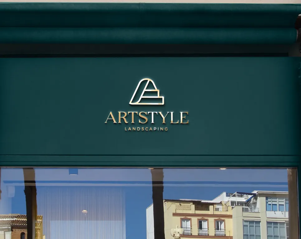
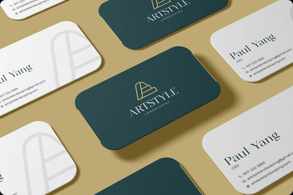
A simple business card with the logo on both sides, plus the same logo on the storefront and stationery.
01 / 05