
Case study
Michele
Denniston
A clean, confident brand for a real estate agent.
- Client
- Michele Denniston Real Estate Group
- Real estate · Schomberg, Ontario
- Scope
- 01Logo design
- 02Business card
- 03Signage
A house in the name.
Michele Denniston wanted a brand that showed how seriously she takes her work and her clients. It had to stay simple and still stand out on a street full of signs, a business card or an office canopy.
Touchpoints
Signs and cards.
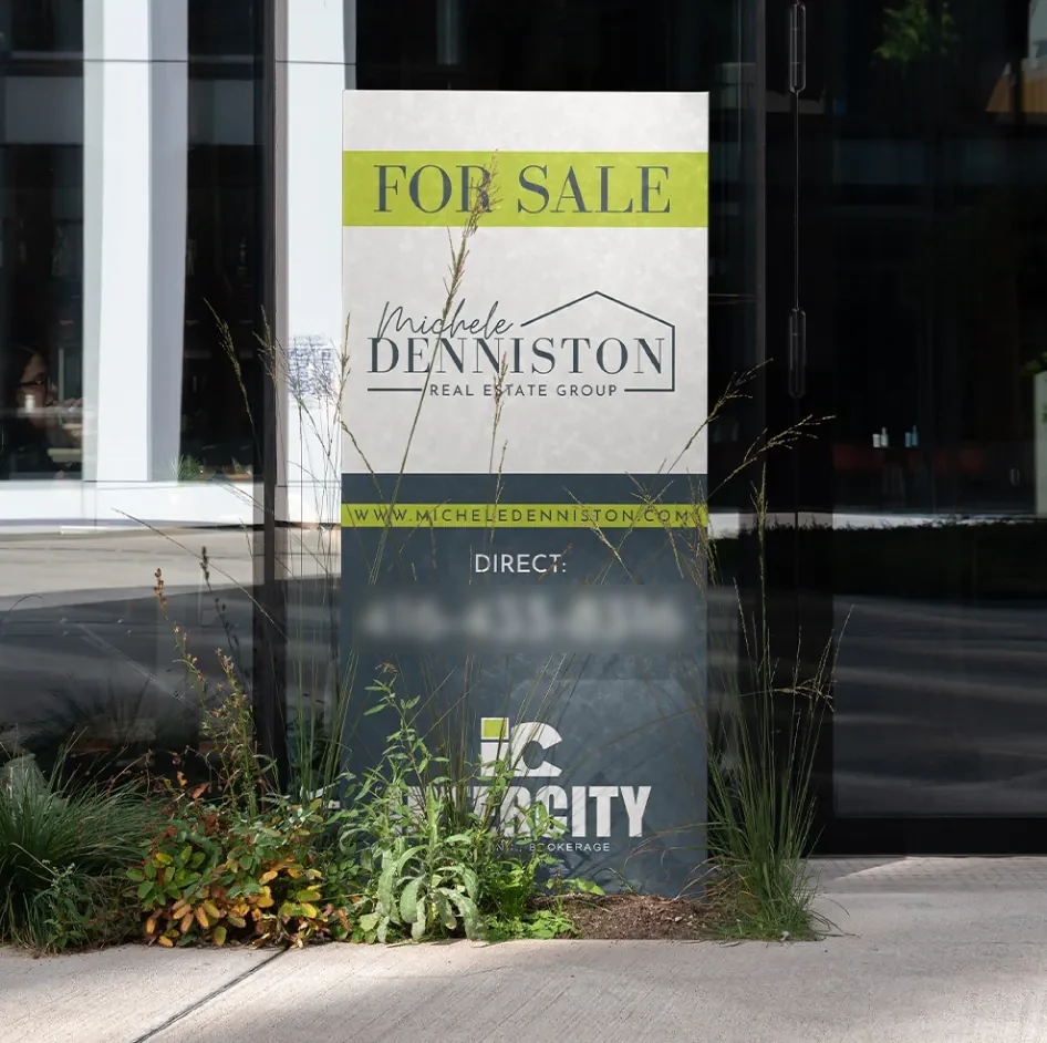
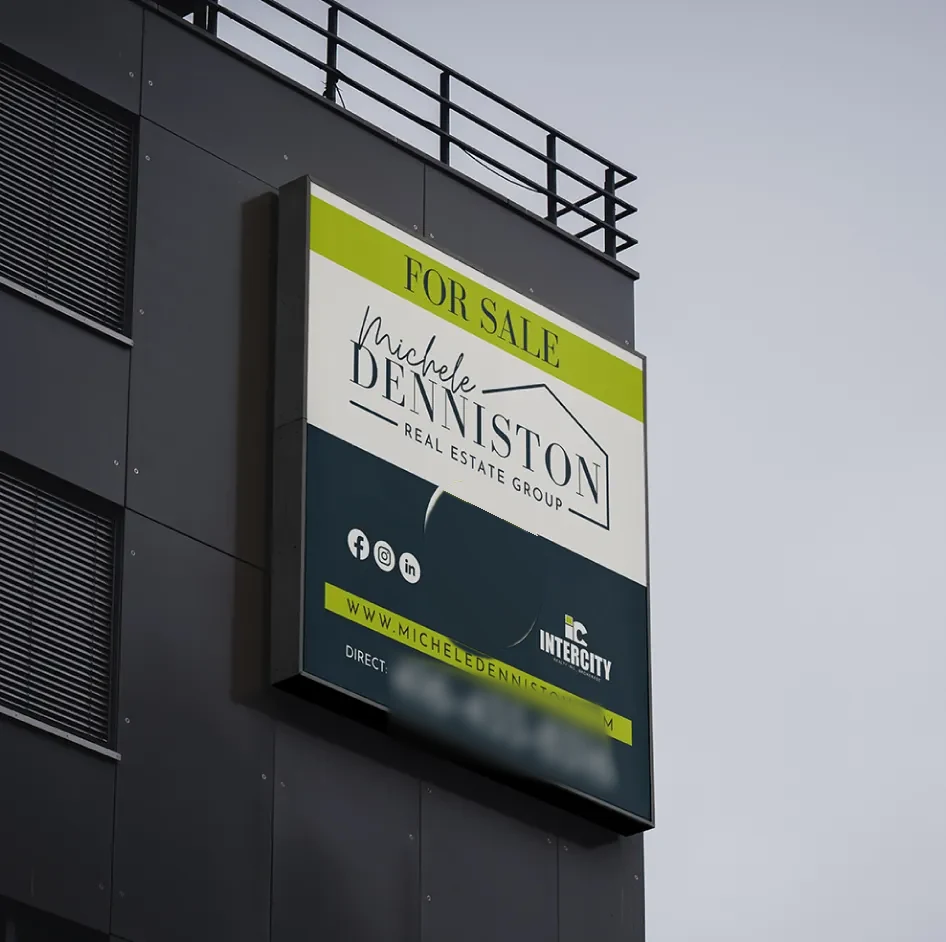
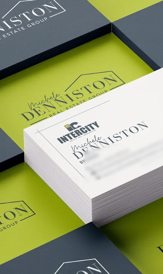
Her yard signs, hanging signs and business cards all use the same logo and colours, so people know a listing is hers before they read her name.
01 / 03
The mark
The logo
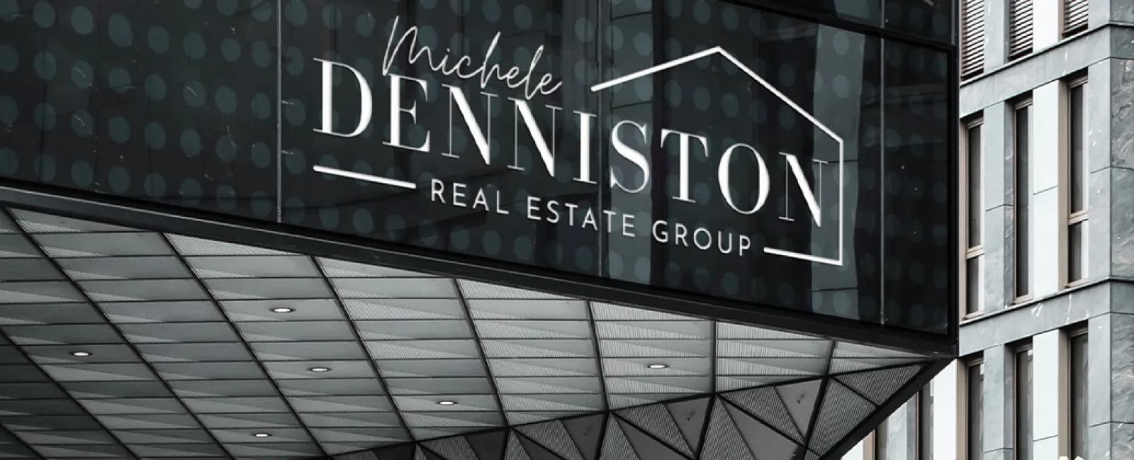
A clean wordmark with a house in the name. Her signature sits next to a simple roofline for the group, and it stays easy to read on a card or a canopy.
01 / 03

Colour
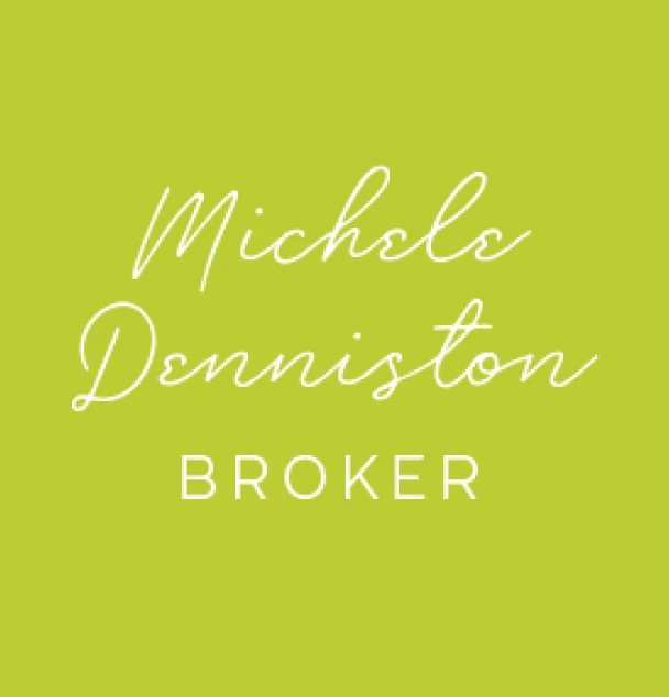
Lime green and charcoal blue.
Lime green is the main colour, and it adds energy. Charcoal blue adds trust and keeps things steady. White gives the type room so it stays easy to read from the street.
Lime green
#BCCB32
Charcoal blue
#34454F
White
#FFFFFF