
Case study
Euro Lifts
A clean, type-based logo for a home elevator company.
- Client
- Euro Home Lifts
- Home elevators · Toronto, Ontario
- Visit the live site
- Scope
- 01Logo design
- 02Business card
- 03Web design
A logo made of letters.
Euro Lifts needed a logo and brand that said safe, reliable and made to measure. It had to look professional and modern without feeling cold, and stay clear from across a room.
The mark
The logo
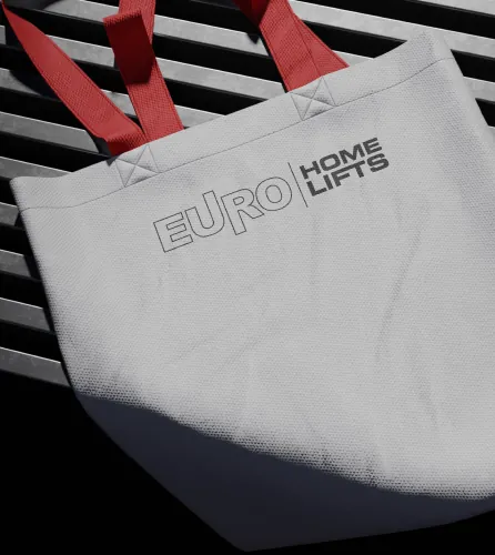
EURO in outline and HOME LIFTS in solid letters, split by a thin line. It looks the same on a business card, a tote bag and the wall inside the lift.
01 / 02
Colour
Deep blue and white.
Deep blue says trust. White keeps the logo clear from a distance, on a card or inside the lift.
Dark imperial blue
#1C2C5F
White
#FFFFFF
Touchpoints
Cards, badges and the lift.
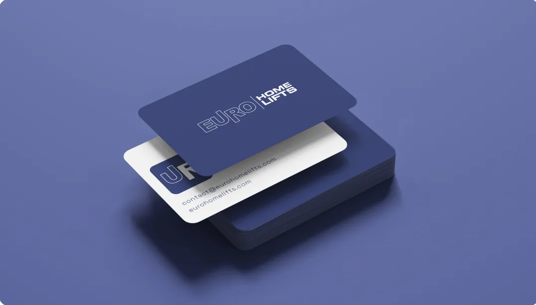
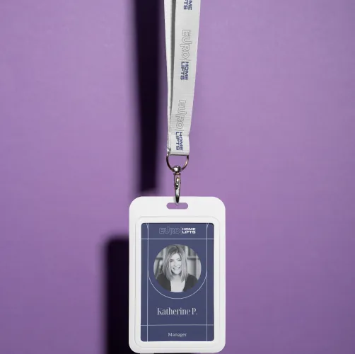
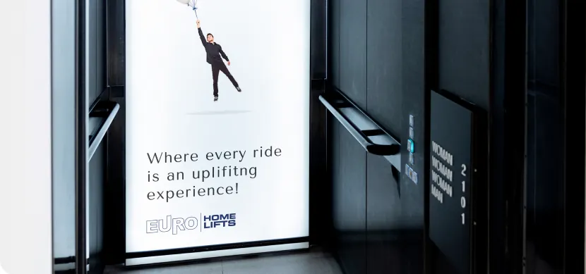
Navy and white business cards, the same logo on a staff badge and a tote bag, and a poster on the wall inside the lift.
01 / 04
We built the Euro Home Lifts website around a lift you can open. Homeowners get a feel for living with one before they ever step inside.